The title of our thriller is 'Kett's Heights', and it is of the horror/psychological sub genre. We have stuck to the generic conventions of these sub genres on the whole, but have also included elements we thought of ourselves, or developed on from other thrillers (through intertextual references).
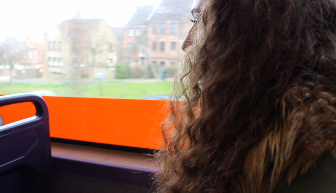
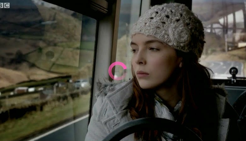
Firstly, the mise en scene fits the generic conventions of the sub genres although the guidelines for this were rather vague and broad so there was a lot we could fit in. For the scenes on the bus at the beginning of our film (see below), there are people in the background of shots as well as lots of buildings, which suggest an urban location. In addition to this, the bright, harsh colours of the interior of the bus, like the red strip near Lucia in the screenshot below, and the purple colour of the seats are vibrant, and lure the audience into a false sense of security. This false sense of security is typical of both sub genres, but particularly the horror thriller sub genre. Having said this, this sense of security (through mise en scene) is usually established before jump scares. We have not used any jump scares because we want the audience to feel scared/uncomfortable slowly, through subtle changes, like the change in mise en scene. We got inspiration from from the BBC TV series, 'Remember Me' (one of our intertexual references). In one scene, the female protagonist gets on a bus, and the mood of it is very melancholy, partially due to the mise en scene. It is raining and dark and dismal looking outside, with a semi urban location. We used similar shots they did, but the mise en scene is slightly different. Unfortunately we could not recreate it for this scene, although pathetic fallacy is present in both.


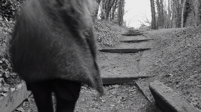
When Lucia arrives at Kett's Heights the mise en scene changes, as do the colours. The picture below shows the greens, greys and browns of the location. These colours are associated with nature, showing the transition from an urban to a more rural, isolated location, making Lucia seem much more vulnerable. The colours we chose for her outfit make her blend into the landscape, so she looks even more anonymous-something we managed to achieve through the mise en scene.
The woodland area we filmed in for part of our opening created an eerie ambience, through the handheld shots of the quiet and isolated location. The lack of any other people in the scene reiterated this. It is similar to convention in that in one of our intertextual references, the Blair Witch Project the location is woodland too. This is common with the horror thriller sub genre.
On the other hand, when Lucia places the flowers down (followed by flashback scenes), the audience will be able to see railings, steps and a beacon where Lucia puts the flowers. Also, buildings may be in the frame in the background, and although they are out of focus, it shows a semi urban location. In a way, this breaks the generic conventions of our chosen sub genres, as traditionally when someone gets killed or injured they are alone, and in a completely isolated/rural location. We broke these conventions because Lucia reaches this part of the Heights just before the antagonist grabs her, luring the audience into a false sense of security, something we wanted to do more than once so that the outcome seems more shocking.
Thus, for the majority of the shots we stuck to the conventions of our sub genres for both mise en scene and location. This in turn helped us achieve an eerie ambience that would make many viewers feel uncomfortable.
There was a considerable amount of colour symbolism in the costumes we chose, in particular for Lucia's. Intertextuality also played a part in deciding costumes. The pinks and greys are taken from Amelia's costume in the horror thriller film 'the Babadook.' We also took inspiration from 'Remember Me', as Chloe's costume is also similar. These both symbolise the lack of life in their characters and their melancholy mental state.
There was not as much thought that went into my character's costume, or for the flashback scenes as a whole, we just wore our normal clothes in order to reflect or suggest our age (teenage). We also had to make sure that Lucia was in a different outfit for the flashback scenes to make it seem more realistic. The colours of these outfits did not matter in the end because we edited the clips so that they were in black and white.
When planning the costume for the antagonist (Geoff), we wanted something simple but a bit scruffy, hence the tattered parka he wears. We did not concentrate on Geoff's costume as much, because we knew from the beginning that he would not be much of a physical presence, but more of part of the atmosphere, almost like a mental manifestation for the audience. The appearances of all those featured in our film link directly to their costumes, as I feel they are reflective of their character. We have stuck to convention in that we have a male antagonist and a two female victims.
When it came to props, we did not break convention but we did not follow it either as we could not find many guidelines, as they vary from film to film. However, we did use our prop as a motif which is something I had looked at in my research. The motif in this piece are the flowers Lucia carries, which are pink carnations. They do not have any significance in relation to our thriller, we just thought we would buy a bouquet that would compliment the outfit and draw attention to her costume. This motif shows mourning, and when Lucia puts down the flowers Geoff, the antagonist approaches so in a way they also protect her. The only other props we used were the candles and the other flowers, although they were not as important and just showed the audience that someone was definitely killed at the location if they were not sure as the flashbacks aren't completely explicit.
The lighting played an important part in showing the transition in atmosphere of our piece. The harsh, diegetic lighting of the bus scene juxtaposes with the natural yet low key lighting seen in the rest of the film. The transition in location can also be seen through the use of lighting. The lights on the bus can be seen in some of the shots, and the harsh light makes it seem artificial and bright. However, the lighting as described before at the Heights is not only natural but also fading. This meant it was difficult when reshooting, as we had to try and go at the same time of day. Also, as the sun set quickly, we had to make sure we had sufficient footage and that it wasn't too underexposed.
When we went back to reshoot it was very light, as you can see from this photo.
This is a problem with filming with diegetic, natural light, as we could not rely on the weather. We had to locate shadier areas and film there instead so the colour temperature looked just about the same.
We used lighting and pathetic fallacy together to create a suspenseful ambience, the back light and even hair light in some shots of Lucia, and overall during filming.
(Sunlight on Lucia's face/props)
This suggests that the sun is setting (which it was) and because we filmed the plot mostly in chronological order, it got darker as the antagonist got closer. This in turn is suggestive of his character, and of Lucia's fate.
I think sound was one of the most important features in our film. It helped create a sense of dread and suspense for the audience. We had problems with the diegetic sound, as I don't think we saved onto the programme properly at first. In a shot of me running there is a siren going off in the background, which at first we thought we would have to add in, making it non diegetic but coincidentally one went off in the background. This is symbolic of danger, and acts almost as an omen, ,making it an ambient sound.

The soundtrack of our film also helped us convey feelings of suspense and dread.
Torrey Desmond Rogers composed a track and let us use it for the film as long as we given him written credit, which we have. There is a droning sound throughout the track, hence the audience feeling of dread we are trying to prompt. It is at a single pitch throughout most of it and presumably an underscore, it is also quite muffled. This way it won't be very distracting or overshadow the actual piece. We lowered the decibels when editing to ensure this.
Non diegetic sound was the most important feature for sound, as I think it again creates ambience and also gives the audience some vital background information without using narrative, which is an obvious and cliché way to reveal information. Although it is commonly used in the genre, it is used by professional actors. We thought it would be too much of a risk to use dialogue, so instead tried to use non diegetic sound for the same effect. To make sure the transitions between sounds (e.g. the soundtrack and another clip added in) were smooth, we used effects within Premiere Pro so a soundbridge was created.
The first non diegetic soundclip we used was from a Real Crime documentary. It is of a police official describing a convicted paedophile and murderer, and how he would murder again if he was released from prison. We thought this would be perfect as it shows that the antagonist is capable of killing multiple people, and how he is not remorseful. This non diegetic soundclip also helped us build up the antagonist's character, and revealed a small amount of information about him, leaving the audience both intrigued and on edge.
The second non diegetic soundclip we used was from Look East, a local news bulletin. It is also about a murder, but this time the reporter says that the body of a woman has been found. We used this to foreshadow Lucia's fate, as well as to again reveal information. Without this narrative, the audience would not know what was going on in the scene, making it a vital part of our piece.
The last non diegetic soundclip we used was from the film 'the Night of the Demon.'
I think this one is the most suspenseful and shocking, and grabs the audience's attention. This is mainly because of the speaker's tone of voice, but also because he tells the audience 'it's coming.' This should provoke fear. It is placed quite far in in the clip, so the progression of the sound not only reveals background information, but also helps heighten the suspense.
To begin with, we used lots of close up shots, as seen below.
We used close up shots because we didn't want to establish too much, so that we would intrigue the audience. However, we did reveal vital information - that Lucia was travelling somewhere, by bus, and that she was by herself. We did use a wide shot of the bus with people on it, as well as mid shots to show how busy it was, and the time of day.
It was important to show Lucia getting off the bus and reaching the location otherwise there would be a lack of continuity. We did this by filming a close up of Lucia pressing the button to stop the bus, and a mid shot of the stationary bus.
Two of the most successful were these wide shots:
This is firstly because of the depth of field, which goes from quite shallow to deep. Secondly, we edited the clips so that when the scene flashes back, Lucia walks up onto the step that she did with me.
We tried our hardest to include a variety of shots, from POV to extreme close ups. A shot that was meant to be POV and handheld was this one below.
However, because we were using a DSLR which was at the time set to autofocus, it was too steady and in focus, and when watching it back looks more like a pan shot.
A more successful POV (and tracking) shot is this one:
This was more successful because the camera was handheld and we deliberately tried to make it shaky when walking towards Lucia.
I think the reason why this one was more successful was because it was a tracking shot so created fear as it showed that the antagonist was following her whereas the previous POV shot looked more like an establishing pan shot.
As said before, we tried to use a variety of angles. This worm's eye/low angle shot was used when we filmed one of the flashbacks. We decided to use a low angle shot as it usually has connotations of power. It is suggesting to the audience that when the female characters are in a group, they cannot be harmed.
This extreme close up shot is another example of our variety of shot types. Again, this is probably one of our most successful shots. This is because of the quality, the focus and the non diegetic light given off from the candles, which give the flowers a kind of glow. The framing of this shot also makes it one of the more successful ones, as the plastic the flowers were in is blurred, and the shallow depth of focus draws the audience in, despite the flowers not being positioned in the centre of the frame.
One shot type that we did not include was a dutch tilt shot. We decided against including this in our thriller as it doesn't really stick to generic conventions of a horror/psychological thriller. It fits more into German expressionism films and perhaps in found footage thrillers too, like the Blair Witch Project. We couldn't find an appropriate place to include it in so decided not to at all.
We used a non linear narrative in our thriller in order to reveal information about the main character's past, through flashbacks. Nothing within our narrative is typical of the genre, as there isn't really a conventional narrative structure for either of the sub genres. This didn't end up being a problem because we found it fairly easy to plan the narrative structure, and flashback scenes were vital in giving away information. Films that do use flashbacks that we looked at briefly or have watched recently are 'the Woman in Black' and 'Shutter Island.' In both of these films, flashbacks are used to reveal something about the character's past, and also often happen to emotionally disturbed characters, in all genres of film. This fits in with the character of Lucia, who is also emotionally unstable. This in turn amplifies one of the sub genres of our film, psychological horror because they typically include several emotionally disturbed individuals.
Inspiration for the font we used came from the film 'Seven', which we studied in our research, combined with Rose's research into handwriting and serial killers. We used the website 'Dafont' and found a font called 'beautiful horror.' It looks quite rough and jagged, and we layered it when editing to make it look like it had been scratched in. This was to show the disturbed mind of our antagonist, who is rather like the killer in 'Seven'.
We had two main problems with the titles that we had to solve when editing. The first was that we wanted them to flash on the screen several times, but couldn't find an effect that would allow us to do this, so instead we duplicated them like this:
(See 'Title 09').
We also had to shorten the duration of them. This was successful because it mirrored the movement of the titles seen in 'Seven.'
The second problem we had was with the titles of the film's name.
The font we used was quite thin, and we were not able to make it bold when editing. Thus, at first, the title 'Kett's Heights' blended in with the background and was barely visible. We duplicated it so that it stood out.


