Wednesday, 31 December 2014

CASE STUDY #5 - PRIZZI'S HONOUR

Although this film is described as a 'black comedy' (rottentomatoes) it has lots of crime thriller elements in it, and more importantly two femme fetale prototypes.
It was directed by John Huston, and stars Jack Nicholson, Kathleen Turner and Angelica Huston. T
The film has been described by the Radiotimes:
"Director John Huston's penultimate movie sees a return to the type of film noir with which he made his name in the 1940s, sent up here as a black comedy. It's something of a family affair, with his daughter Anjelica in an Oscar-winning supporting role and her then-partner Jack Nicholson in the Oscar-nominated lead. He plays Charley Partanna, a Mafia hitman who falls for and marries Kathleen Turner's foxy freelance hitwoman. Their loyalties are tested (he works for the powerful East Coast Prizzi family, led by William Hickey's wizened Don; she, a West Coast operator, does not) and then shattered when each is tasked with bumping off the other. Complex farce ensues under the steady hand of Huston, and it's all irresistibly dark."


In this case study I will be looking at one of the female leads;  Maerose Prizzi (Angelica Huston) and her qualities, some of them rather unconventional, of a contemporary femme fetale. 
Maerose has been alienated from her mobster family due to an altercation involving Charley, to whom she was engaged. She is presented to the audience as a strong woman who is trying to maintain her composure throughout early scenes filled with awkward situations - like family parties. Although at times she is presented as vulnerable, this is inevitable given her circumstances, and as an audience we soon learn that she is a devious schemer and seductress. There are two particular scenes which clearly demonstrate this, the first being when Charley comes round and they sleep together. This scene also shows her potential as a contemporary femme fatale, as she effectively lures him in through her femininity.
The second (which I will be focusing on) is the scene in which she visits her grandfather and tells her of Charley's wrongdoing-a way for her to get revenge.

The mise en scene of the room immediately tells the audience that the grandfather lives a comfortable, even luxurious existence. This can be identified through his smart suit and plush velvet, richly coloured chair. We can also identify his importance through these elements of the mise en scene. Another indication of his importance is the ornaments seen in the background of the screenshot above, which are an assortment of family photos and heirlooms. On top of this, we can tell the grandfather is important because of the way Maerose has chosen to dress. Her demure tailored skirt suit and matching hat (all in dark colours) look respectable.
Alternatively, her gold jewellery and immaculately painted red nails suggest she is trying to show her glamour/wealth - just like other femme fetales before her (eg Marilyn Monroe in 'Asphalt Jungle). 
Personally I think the director's intention with her costume was both to show how she respects her grandfather, and also to show her glamour. 
It is rather unconventional for a femme fetale to have a family - they are usually completely alone. Some may argue that Maerose is independent, as she lives a very unique life, but I do not think this is the case. She depends on her family rather a lot to get what she wants, even though her relationship with them is somewhat strained. She manipulates her father in a previous scene, telling him she is pregnant with Charlie's child, and manipulates another elder member of her family (her grandfather) in this scene again. 
Her kind gestures, like her kissing her grandfather's hand (see screenshot above) and words are not just a matter of her being courteous, but also about her sweetening her grandfather up, reiterating the point I previously made about her depending on others. 
In addition to this, Maerose's cunning way of thinking can be seen in these instances mentioned above about her manipulating male figures, as in their mob family they hold the two largest positions of power, and therefore if she can sway them, she can get what she wants quicker.


Maerose successfully exploits her grandfather's influence and thus is partially responsible for the other femme fetale's downfall. Conveniently, her death enables her to talk to Charlie, her ex partner, again-a motive she has had throughout the film. 


The picture above shows the other femme fetale's gruesome death, which Maerose arguably inflicted. 


The end slate is important in the identification of Maerose's character as a femme fetale prototype. I presume (from looking at other scenes in films with the same kind of aesthetic) that they have used a stocking over the film lens in order to create a soft, feminine look to it, mirroring Maerose's attributes seen at this particular moment-she is quietly talking to Charlie on the phone, and everything seems calm and serene. Minute details, like the pearl earrings and necklace show a softer, more likeable side to her character, as does her light floral dress. All of this compliments or adds to the camera effect, making it seem almost dream like.
This is also complimentary to the outcome. Unlike most femme fetales, Maerose has not been ill fated an has got exactly what she wanted-in a subtle and sophisticated manner.


Tuesday, 30 December 2014

CASE STUDY #4 // TECHNICAL CODES IN ''THE BIRDS'

Analysis of a scene from the Alfred Hitchcock film 'The Birds.'


At the beginning of this scene, people are fleeing from the hoard of birds chasing them, and as you can see, in the background of this wide shot Melanie is running away from them and trying to find shelter. The wide shot establishes the setting, the non diegetic light (minus the flames added in) establishes time of day and the surrounding buildings and motel sign show it is an exterior shot. The (mostly) diegetic sound of people panicking demonstrates a manic and chaotic ambience, the non diegetic sound of the birds adds to them seeming menacing to the audience within the actual picture as they are chasing people. 


The camera then moves to a close up of Melanie hiding in a phone box. The audience can tell that it is a place to hide in as her coat is the same colour as the building behind so therefore camouflages her. The look of terror in her face adds to the chaotic ambience. The birds flying around in the foreground of the shot(presumably added in through early CGI) and in the background show that the threat is still imminent.


It then moves to a mid shot of Melanie attempting to close the phone booth, the fire surrounding it again demonstrates that the scene is still chaotic. The fire is also surrounding the phone box, perhaps showing that she is trapped, it could also be interpreted as a subtle omen that Hitchcock decided to include. This is a valid point as Hitchcock is well known for including such visual elements in the foreground of his films for both aesthetic affect and also to leave the audience wondering, creating an air of suspense, vital to any climatic scene.


Monday, 29 December 2014

CASE STUDY #3 // CHILDREN IN THRILLERS

In this case study I will be looking at the film 'Leon,' which is a French thriller film, described by critics as "stylish and oddly affecting". The plot is as follows:

  1. "Mathilda (Natalie Portman) is only 12 years old, but is already familiar with the dark side of life: her abusive father stores drugs for corrupt police officers, and her mother neglects her. Léon (Jean Reno), who lives down the hall, tends to his houseplants and works as a hired hitman for mobster Tony (Danny Aiello). When her family is murdered by crooked DEA agent Stansfield (Gary Oldman), Mathilda joins forces with a reluctant Léon to learn his deadly trade and avenge her family's deaths."
     
  2. The director, Luc Besson, was criticised for his presentation of children in the film, with critic Robert Ebert stating that there was something immoral, or "wrong with placing a 12 year old in the middle of the action," especially as it "seems to exploit the youth of the girl without really dealing with it."
  3.  
It could be argued that Mathilda has already been exploited or at least exposed to crime as she appears to be quite strong and confident, she smokes, comes from a dysfunctional family and goes to a school for troubled young girls. Her costume (designed by  Magali Guidasci) also suggests that she is streetwise and mature, she wears a fashionable choker, a crop top and an oversized bomber jacket, which looks slightly scruffy but far from childish given her real age (12). Having said this, her unkempt 'grunge' appearance does show the kind of background she is from, subtly implying her impoverished background and her struggle, a stronger representation of her character rather than it solely being a fashion statement.


When her family are murdered by a corrupt police man, Mathilda appears to the audience as incredibly vulnerable, she is not only grieving but is now in danger herself. After being reluctantly being taken in by her neighbour Leon, they form a bond. This is something totally innocent, and in the end Leon becomes a surrogate father for Mathilda.
 
Her quick attatchment and subsequent admiration for  Leon is to be expected, given that she has never been cared for or protected. This initial admiration and like for Leon turns into something of an adoration, with Mathilda professing her love for Leon which he rejects, primarily due to his natural suppression regarding her age, and his motto "no women, no kids", Mathilda fits into both catogeries so Leon cannot help but be taken aback and worried by this new found, unrequited love. Despite this, Mathilda persists and when asked by a stranger about her 'father' (Leon) she says "he's not my father. He's my lover," showing her perseverance to consider him as being romantically involved with her, as well as for other people to think that.
 
It can be argued that Mathilda is more of an adult than a child, although this remains ambiguious for most of the audience, and is dependent on opinion. Age wise, she is still classed as a child, but her attitude and appearance suggest otherwise. As I have mentioned before, Mathilda's does not maintain a youthful look and in addition to this, even her hair (see below) is cut into a mature style, mimicking an adult's.
 
(Taken from siridisi.org)
Events like family problems prior to her meeting Leon account for her mature outlook, but her age and youthful face appear to override her attitude and elements of her physical appearance. Her wordly possessions, in particular her toy rabbit, show her as being nothing but a child, vulnerable and extremely unconscious against the crime ridden background she has always been familiar with. Critics arguing for the exploitation of the youth of the girl in this film have evidence for this, with the juxtaposition of her comforting toy, age, natural naivety and hidden nervousness against the guns, violence and drugs that she is exposed to.
 
As Natalie Portman was only eleven when she was cast to play this role, I too think that although it was a brilliant portrayal, did not cover the issues she had to deal with in enough depth, and instead played on her innocence and age not to highlight themes but to get more of a reaction from the audience, which although would be an intention of the director is not fair on the character or child actor, who would not (I think) always be fully aware of the circumstances of the situation being filmed or their implications (like being a side kick for a hit man), and in this case is also a glamourisation of violence.


Friday, 12 December 2014

CASE STUDY #2- 'ZEN' // TWIN PEAKS

Twin Peaks is an American crime drama / thriller directed by David Lynch in which "an idiosyncratic FBI agent investigates the murder of a young woman in the even more idiosyncratic town of Twin Peaks," (IMDB) and the series is often remembered with it having a distinguishing and odd tone to it. I will be focusing on the second episode of it, which is titled 'Zen' or 'the Skill to Catch a Killer.'
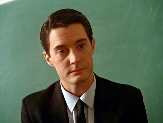
This episode focuses on the main protagonist, a young, intelligent investigator called Dale Cooper (pictured below), and the disturbing dream he has about the recently murdered Laura Palmer. He has ended up in the bizarre town of Twin Peaks after being given a case there by the FBI.


(image taken from the Guardian)


Towards the end of this episode, Dale Cooper returns to his hotel room after a long day of investigation, and experiences a disturbing dream with strange and surreal dimensions to it. In this dream sequence, the audience see a red room decorated in a 70s art-deco style, with neoclassical ornaments like a Roman statue, adding to the audience's confusion and initial intrigue. There are 3 characters placed in the room, and the opening of this scene is a wide shot of the 3 sitting on chairs, the rule of thirds also applies here, which appeals to the audience visually.


The facial expressions of the 3 characters also give the viewer clues about the mood of the scene, Dale seems blank which is perhaps a projection of his dream like state, and Laura Palmer is smiling, unusually calmly composed, adding to the strange tone. The man in the middle, commonly referred to as ' the man from another place' looks delirious and excited, and gets up to dance in within the first 10 seconds of the sequence, which is something completely bewildering to the audience. In addition to the diagetic light coming from the two lamps from behind the chairs, there is what looks like a camera flash added into the scene at 10 seconds, as soon as the man in the middle starts to dance, this strobe lighting also adds a faster pace to the slow moving scene.  The situation seems to get weirder and weirder as he moves to the edge, past Laura Palmer and continues to dance, with soft 40s jazz music playing in the background, a noir influence of Lynch's part although it is not clear to the audience why this is included other than to add another purely abstract element  so prevalent this scene.  His contorted, disjointed body movements shows an almost drug induced, hysterical state. From this, we can see contrasts of the cause of Laura Palmer's (shown in the scene) death which was partially through drugs. Having said this, it is not a clear juxtaposition, and not easy to identify at first, adding to the confusion. 

After the dance sequence, at around 0.38 seconds, Laura Palmer calmly gets out of her chair and slowly walks towards Dale Cooper, there is a shot reverse shot of Laura walking towards Dale, Dale's dazed yet slightly blank facial expression and then Laura again.


In the next part of the scene Laura seems to be trying to seduce Cooper and kisses him, and to his surprise she also whispers in his ear the name of the killer, which he later can't remember. This amnesia which the audience pick up on could be partially due to the kiss acting as a distraction, but also could be because of the lighting, the strobes overpower this part of the scene and are almost blinding. Dale also wakes up straight after this, and there is a jump cut to a close up shot of him in bed waking up, so the audience automatically think it is a dream. However, there is another layer of mystery added to the scene when he starts to click his fingers to the beat of the music still playing, demonstrating a continuation of the dream sequence and reality, and therefore a struggle for the audience for the differentiation between the two. He also tells someone on the phone that he knows who killed Laura Palmer, if this was a dream then why would he take it so seriously? This, among other questions, would be something playing on the audience's mind, and it being left on a cliffhanger adds to the suspense and intrigue.


Thursday, 11 December 2014

CASE STUDY #1 - JACKIE BROWN & MIA WALLACE

An analysis and comparison between the character of Jackie in Quentin Tarantino's film 'Jackie Brown' (1997) and Mia Wallace in his film Pulp Fiction (1994) which are both crime thrillers. In this case study I will primarily be focusing on representation.

Character profiles

MIA WALLACE 


Dependent on her husband's wealth, addicted to cocaine and generally passive. The relationship she has with her husband is a mystery to the audience, although we can gather that he is very protective over her, he threw one of his colleagues (he is effectively a mob boss) off a building for giving her a foot massage. This begs the question of why (or even if) she was allowed to go to dinner with Vince. Immersed in crime and addiction due to her gangster husband, Mia is represented as a contemporary femme fetale - intelligent, beautiful, mysterious and seductive. She is a character who is not featured for a long time in the film, but is one of the most memorable.
An extension and projection of her husband, her authority and power is shown when Vince, a hit man working for Mr Wallace, who takes Mia out to a restaurant. Vince is worried by her forward attitude and about doing anything wrong, as she could easily report back to her husband and get him killed. She also manipulates and toys with him seductively and intellectually, using her sex appeal and intelligence which displays her beauty and power, as well as her somewhat deviant nature. 
She leaves Vince with little information when talking, for example Mia tells Vince about a previous role in a television show in which she told jokes, but refuses to tell him any jokes or more information about her past, adding to the audience's intrigue and at the same time getting them to question their opinions on her - is she really a passive, dependent weak woman or a quiet, mysterious and powerful one putting on a façade? Although Mia seems to have the upper hand, her fate is not as the audience would expect of such a headstrong character. 
This could be because her representation is not conventional. She does not wear traditionally feminine dresses or heavy make up to express her femininity and sexuality (like usual femme fetales), but instead dresses in trench coats and tailored suits, very much like a man. In a male dominated world of crime, is Mia trying to fit in? Presenting herself as tough, intimidating and masculine makes her seem less vulnerable, and dressing in such a way would be an obvious way to do this. She ends up overdosing on heroin which she believed to be cocaine, and is rescued by Vince who eventually gets help, instantaneously becoming the helpless female victim that depends on male assistance, relying on those around her, Tarantino ultimately presenting her as the weak wife, never able to be independent for long, which is perhaps reflective of societal stereotypes for the wives of those heavily involved in organised crime as well as femme fatales.


JACKIE BROWN


Jackie is presented as an assertive, independent, streetwise middle aged black woman. Her race is centralised throughout the film, and can be seen in the opening scene. 
The background music of this scene is Bobby Womack's 'Across 110th Street', which has some thought provoking lyrics. It becomes apparent that Tarantino selected this for a specific purpose, as it is already known that he stresses an importance on music (seen in interviews and commentaries). The lyrics act as a clue to Jackie's situation, as Womack talks about financial struggle ('doing whatever I had to do to survive'), societal structures (references to 'ghettos') and moral issues arising from this. Jackie's identity is immediately categorized merely through binary restrictions of being an African American, with connotations of poverty and desperation, which can be seen especially through the lyrics of 'Across 110th Street.' 
Her physical appearance is something that stands out throughout the film, her smart, clipped airport uniform, perfectly styled hair and her confident stance and self contained demeanour make her seem both independent, desirable and attractive to the audience. Brown is presented as a survivor, who has not turned bitter or cold from her past experiences on the streets. She is also not dependent on a male at all. Despite her involvement in crime, she is seen as incredibly wise, outwitting corrupt antagonists (i.e. Samuel Jackson) and is purely in it for her own financial gain, the security which assures her independence. This is a juxtaposition with the average male protagonist in films of the crime sub genre, and in all these examples covered, Jackie Brown subverts all of these cruel stereotypes, and is portrayed as a quiet yet self assured heroine. 


Comparison

The most notable difference between the two women is their level of independence within financial and societal spheres. Mia is completely dependent on her husband's money, and without the bond of marriage she would not be in any position of power, her status only elevates her and helps her mask her true identity, which can often be interpreted as her being weak, passive and completely unmotivated. Jackie, on the other hand, is wholly independent, and has no problem with being a lone figure, having no reliance on a man who could be seen as irrelevant in her plans as she orchestrates her own fate throughout the film whereas Mia is controlled by men like her husband. This links to the success of each character, with Mia ending up almost dying, leaving her weak and Jackie walking away from the situation with a prosperous looking future.

A similarity is that both characters are subject to stereotypes but Mia does not subvert this stereotype unlike Jackie. Brown's stereotype is also damning, with other portrayals of African American women being negative. For example, in the film 'Precious', Precious and her family live in a ghetto with no real means of financial security, and the children featured in it are subject to abuse. Also, in 'Ghost', Whoopi Goldburg plays a character who lies and plays on emotions to get money. In Jackie Brown, however, Jackie is presented as someone relatively wealthy, independent and strong willed, with no sign of poverty or deprivation on any level. Although she is involved in crime, it can easily be argued that she does not hurt anyone purposefully to get easy money, the violence in the film is never because of her direct involvement.

In contrast, Mia is presented as a contemporary femme fetale, doomed from the beginning, controlled by her husband and having to be rather submissive and meek in comparison to other (male) characters in the film, and certainly in comparison to Jackie.

Another thing the two characters have in common is that they are arguably both very beautiful. Having said this, Mia and Jackie use their femininity in different ways. Mia, although dressed in a masculine fashion, uses her physical charm and allure for her own gain, and as a way to manipulate men. Jackie, on the other hand, does not comply with this at all. Despite her beauty, physical charm and expensive looking, coordinated outfits, the audience can see that she does not explicitly use this as a way to get what she wants, unlike Mia. Brown is able to wear pretty looking clothes and use makeup as an expression of her femininity without having to use it to gain anything, it is merely her own choice. This demonstrates her independence and control over her own life, and in Mia's case, only highlights her desperate yet passive attitude and her willingness to comply with societal stereotypes and expectations, unlike Jackie.

Tuesday, 9 December 2014

THRILLER TITLE SEQUENCES - SE7EN


'Se7en' is a crime/neo noir thriller starring Morgan Freeman, Gwyneth Paltrow and Brad Pitt and follows two homicide detectives looking into the case of several sadistic killings, all with a trail that leads back to the seven deadly sins.


The title of this opening sequence has incredibly short cuts, with many lasting only 2 seconds which means the audience have a lot to take in, sparking feelings of confusion. The opening shot of a book and text is important as the font reveals something about the content of the film. It is in a typewriter font, inferring a time period - pre computer age, as well as the intelligence of individual characters who are perhaps literary. A typewriter is also something a detective would have used, fitting with a convention of the neo
noir sub genre.


The handwriting suggests that the subject matter in this film is going to be disturbing, the audience can infer this both from the scratchy, deep writing and the chilling, rattly soundtrack which has background noise of creaks and echoes at a high and uncomfortable pitch, making the viewer feel uneasy.
This birds eye view shot is the closest to an establishing shot that there is in the duration of this sequence, yet it still provokes questions of who and where, adding to the suspense and confusion, two key feelings associated with this sub genre.


More squeamish members of the audience would probably feel quite nauseous at this part of the sequence as it appears that in this extreme close up shot someone (still remaining completely anonymous, adding to the mystery) is peeling off the skin on their fingers with a rusty tool, causing the viewer to squirm in their seat. Although this is not explicitly gory, it has underlying tones of it being grisly, perhaps giving the audience a clue as to what happens next, with gruesome killings carrying the plot. It could be argued that it acts as an omen.


In this part of the sequence, what looks like a mugshot is drawn on and the text flashes on the screen again, but is shadowed (by the same titles). The handwriting is nowhere near fluent and is not flowing either, suggesting a deliberation of words, almost an analysis, suggesting that the person writing it is either a child, uneducated or writing these words carefully, suggesting his or handwriting is of importance, predominately due to its repetition/constant use. 


Parts of the sequence have symbolism in them, although it is almost impossible to tell as they disappear in seconds. This particular screenshot shows a dollar bill being dissected and God being taken out of it. This could infer that religion is being erased or being a separate, linking to one of the film's themes - the seven deadly sins. Due to this symbolism being so subtle and minute, the audience watching this without analysing in such depth would not spot this, despite the title sequence giving the smallest of hints, perhaps showing that the sequence's purpose is not to explicitly and obviously inform but rather to embed these themes in a secretive way, linking to the mysterious and confusing ambiance of this clip, giving the audience a clue as to how the rest of the film will play out, probably with a similar kind of tone.
 
The title sequence of this film is gripping (and thus particularly effective), I really like the font and when it comes to planning I think I will look at it further and perhaps include an intertextual reference on it.


Monday, 8 December 2014

THRILLER TITLE SEQUENCES - INSIDIOUS


1) INSIDIOUS (2010) "A family looks to prevent evil spirits from trapping their comatose child in a realm called The Further." -IMDB. 

Horror thriller sub genre. Analysed up to roughly two minutes.


The sequence starts without any images, only a black background with the various companies and film companies being listed. The jittery soundtrack adds to the tension in this part, and the way the text drifts onto the screen adds to the suspense, the red text instantly has connotations of danger, blood and violence although the way the words seep onto the screen does not show violence but rather underlying danger, something much more subtle, also noted through the way the text merely drifts in and out of view, showing something less explicit and sudden. The font contributes to the overall feel/ambiance as it cannot be seen directly, only parts of it are seen at one time although the font alone is clear and stark, but only certain letters can be seen in isolation, having connotations of something sinister and hidden to come.


The image of the lamp glowing then comes into view, a clear cut distinction to the black of the rest of the screen. The clear, jagged font of the name draws the audience's attention in, perhaps distracting them from the abyss outside of the lamp, this could be used to distract them initially then add in a jump scare, a common convention of horror thrillers. The way the lamp then spins around disorientates the viewer, contorting their perception of the scene, something clearly done for effect as it is important to leave the audience confused at first to grip them.


The camera then lowers to a wide shot of a little boy's bedroom, which is reassuring at first, in contrast to the ambiguous, black surroundings at the beginning, which quite literally leave the audience in the dark.


The use of lights and gobos are arguably used to distract the viewer for some time, detracting their attention from underlying jump scares. The audience are taken on a tour of the house, although it is unclear where they are situated and what they are doing there, adding to the intrigue. When looking at this  particular part in depth, the colours in this sequence are quite muted, adding to the colder looking temperate, both making brighter colours - like red (from the titles) stand out, and to make the audience feel slightly uncomfortable as cold colours are not associated with being a warm or friendly, the opposite of what a home should be, making it questionable whether this home is comfortable, adding to the possibility of a haunting.


There is approximately 6 seconds of (almost) complete darkness, adding to the tension. Another light is used to attract the audience, making them a reoccurring theme or motif in this opening sequence. The outline of a decrepit old woman's face shocks the audience, leaving them terrified, the key aim of a film of this genre. The face, music and light disappear for a fleeting moment, leaving a pause for a sharp outtake of breath, luring the audience into a false sense of security for a short amount of time, just over a second.


This is arguably the most shocking part of the title sequence due to the abrupt restart of the music, with the strings being amplified, causing high levels discomfort for the audience. On top of this, the title 'Insidious' flashes on the screen, the bright red again has connotations of danger, which are heightened by the soundtrack playing at this point, and the jagged edges of the font used make it stand out against the background, it also looks slightly 3D which again makes it clearer/starker against the abyss like background.


The sequence then jumps to an image of a large house which looks empty, another conventional feature belonging to this sub genre, evoking feelings of unease as they are usually the locations of such hauntings, especially given the title. This time, the image is in black and white with only the names in colour, drawing attention to them and perhaps giving them credit. The way the text is mirrored and then floats away is reminiscent of a ghost, again fitting with the conventions of horror thrillers.


Now the audience is able to see the inside of the house, which looks equally as sparse, and almost soulless. This could indicate to the audience that the house has been left in a hurry or abandoned, with derelict buildings being another common feature in such films.

To sum up, in 'Insidious' the title sequence is used to showcase the cast and crew, to establish the genre (or in this case the sub genre) through text - including font style, editing effects such as the flickering text, and the colour scheme- mainly black, white and red. All other colours are muted or lessened. It can also help to convey the overall tone, which in this case evokes feelings of danger and unease, both due to the soundtrack and the colour red being repeatedly used.


Saturday, 6 December 2014

HOW SOUND AND IMAGE COMPLIMENT EACH OTHER IN 'SIN CITY'


"A film that explores the dark and miserable town, Basin City, and tells the story of three different people, all caught up in violent corruption." IMDB


In this scene from Sin City, background sound (which is non diegetic) helps establish the genre of the film. For example, traffic indicates an urban location, a common feature in thrillers, and especially in film noir. This urban landscape that the audience see is a parallel to the sound of the droning traffic as there are skyscrapers in blacks and greys with washed, faded yellow lights, demonstrating/implying the depressing ambience of the city. 


The soundtrack also helps the audience to establish the genre, the mellow jazz music playing in the background again shows conventions of film noir, and a time period like the 1940s (when jazz was especially popular). This can be backed up by the costumes the characters are wearing, which compliment the music and suggested time period as the man ins wearing a suit, a lot like male stock characters in film noir such as Al in Detour (1945), the smart, clipped look is one favoured by film noir directors for their characters. The woman shown in the sequence is wearing dark red lipstick, heavy eye make up and a long dress, also sticking to film noir conventions, showing the features of the'femme fatale'. 
The red is a stark contrast to the rest of the visuals (which are monochrome), red has connotations of danger, and this compliments the sound. For instance, the sound of the clicking of the lighter alone is ambigious, as it sounds very much like a revolver clicking, inferring crime and danger, just like the red of the dress. This again helps to establish the genre, as film noirs often contain danger and crime.


The non diegetic sound of a lighter clicking compliments the image of the man lighting a cigarette, and again displays a common feature in film noir films which is smoking. I think it was enhanced and made louder through editing, implying that it is of some significance. This sound is almost replayed when the man shoots the woman, although the silencer makes it less obvious and therefore harder for the audience to establish parallels, so there is some subelty to it.
The sound again compliments the image as it infers crime, helping to establish the sub genre of the film, but with the image the gun is quite modern, so infers to the audience that the subgenre is neo noir, not just film noir.

 
Although I think that the sound in this film is used very effectively, and communicates the overall ambience, it does not link to the planning of our thriller explicitly, probably because the genre (neo noir) is not something we want to focus on.


Friday, 5 December 2014

FILM POSTER ANALYSIS


I am going to be looking at 2 different official film posters (used for advertising before the release), one for the first Woman In Black film (2012) and the other for the 2015 film "Woman in Black 2 - Angel of Death." The sequel (Angel of Death) is a historical horrror thriller with elements of the psychological sub genre within it. The plot concerns two teachers and a group of evacuees who have to stay in a secluded mansion called Eel Marsh House, in which a ghost haunts and preys on children. 


The withered and cracked hands would draw the audience in due to them arguably looking creepy/disgusting. The alien, grey  colour of her skin is also scary looking and contrasts with the darker, more human like colour of the child she is touching. Her nails look dirty, adding to the overall gruesome, repugnant look of it. We can identify the hands as belonging to a female due to the Edwardian looking dress she is wearing, the black lace gives it a morbid look (as well as identifying her as the woman in black), something that would be arguably intentional due to the genre - the Edwardian flare gives the audience a clue that it is historical, and the state of her hands show it is a ghost, incorporating paranormal, horror elements into it.
There are two visual elements in this poster which point to psychological undertones in the film. The first of them is the way the woman is covering the child's eyes. It could be inferred that the child is being silenced by the woman in black, or that he or she is being smothered by her, or more effectively her wrath. It could also be interpreted as a symbol of her power over children, as she almost bewitches them into death.
The second is the smaller writing that reads "she never left." The font of this adds to the overall effect, as it looks as though someone has scratched it on, indicating a tormented state, in turn adding to the subsequent horror of the film.
 Another way of looking at this would be that the handwriting font is infantile and therefore links to the motif of children present in both films, and the audience who have already watched the first film know that she preys on their innocence, showing a continuation and therefore appealing to previous audiences/fans of these films, which would be another intention in releasing this poster.
Something I think that does not fit with the genre of the film in this poster is the red used. I agree that it captures the attention of passers by (another key intention) but I do not think it fits with the general agenda of the first film (and the second). The subtlety of the underplayed horror element was a success, therefore I think if they had been in a grey coloured font it would have looked better and fitted with the criteria of these films which have turned them into successes.  


The first film is a supernatural thriller and concerns Arthur Kipps (Daniel Radcliffe) "a widowed lawyer whose grief has put his career as a lawyer in jeopardy, is sent to a remote village to sort out the affairs of a recently deceased eccentric.  But upon his arrival, it soon becomes clear that everyone in the town is keeping a deadly secret.  Although the townspeople try to keep Kipps from learning their tragic history, he soon discovers that the house belonging to his client is haunted by the ghost of a woman who is determined to find someone and something she lost…and no one, not even the children, are safe from her vengeance." (CBSfilms.com)
At first glance, this poster is particularly disturbing because of the way someone has scratched out the two children's eyes. This links to the disturbing subject matter seen within the film, but its primary purpose is to shock the viewer, leading to intrigue. If you look closer at the picture there is a ghostly face that is contorted in a scream (just above the two children).
On top of this, there is what looks like a hand clutching onto the baby, although this is ambiguous and could just be a stain like the other marks around the picture, but this could be used for effect. The caption 'what did they see?' again leaves the viewer guessing, and the way in which the photograph is composed makes it look as though the two subjects are looking at something - or someone.
The font used for this question is the same, child like handwriting previously mentioned, conveying an emotionally disturbed, obsessive state through the repeated scratch like markings.